“Students First” Student Diary
Serving...
...the Alma Mater Society (AMS), the student society serving 50,000+ students at the University of British Columbia (UBC) in Vancouver, Canada. It operates at an annual $30 million budget. It spent $25,000 undergoing a rebranding in summer 2021.
The goal
To create a valuable resource for new, first-year UBC students that boldly debuted the AMS’ new brand identity putting “students first” and as a 100% student-led, student-dedicated organization.
What I did
I designed and wrote the entire 40-page diary + 10-page survival guide, with minimal oversight.
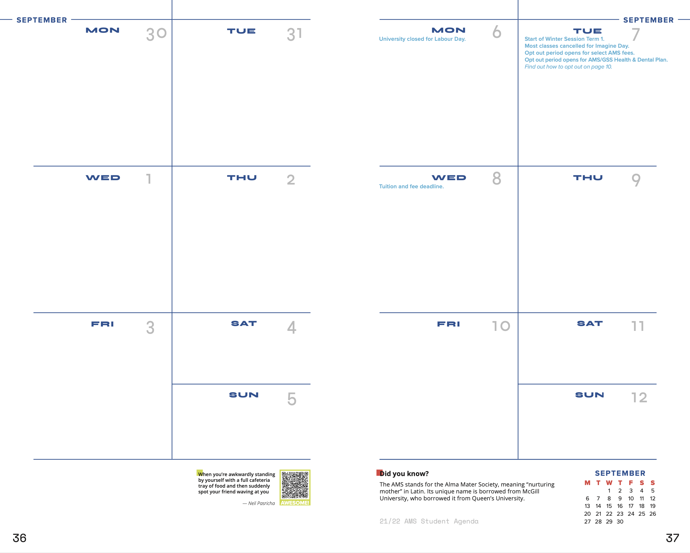
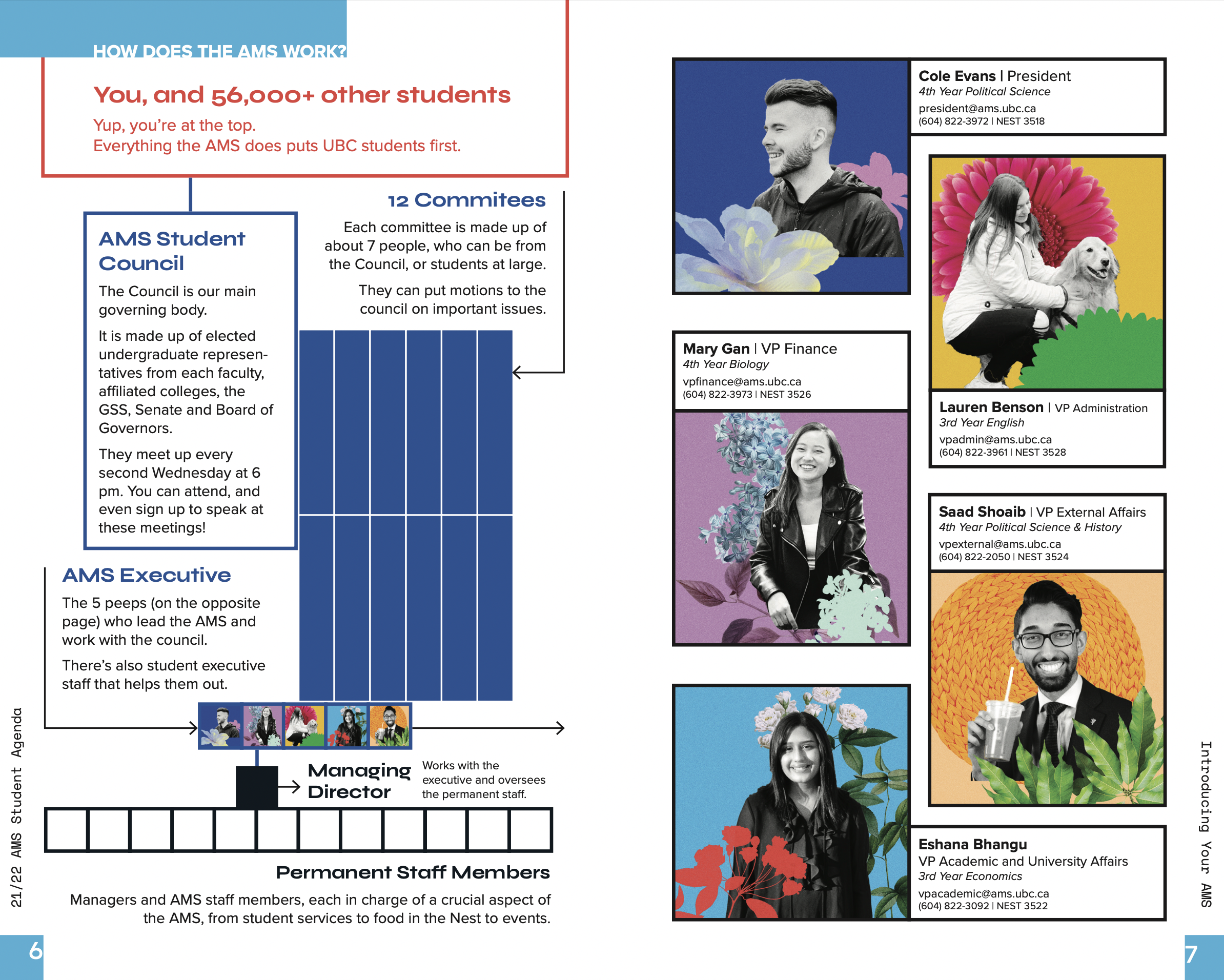
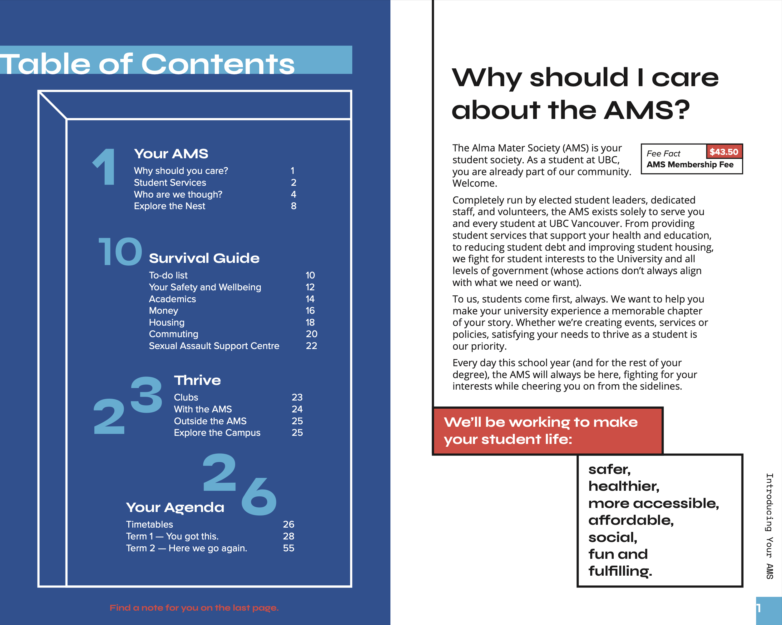
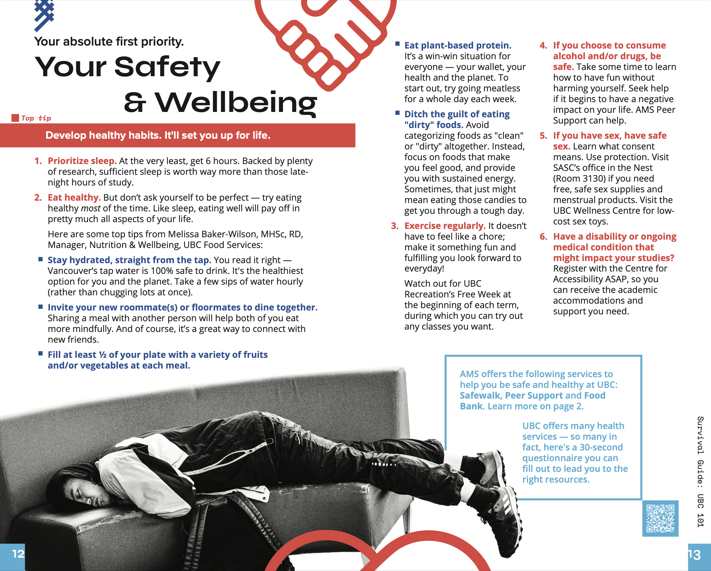
Below are some sample spreads. See full diary here.
How I did it
As the first major design piece that set the tone for a new era at the AMS, I kept “students first” as my guiding design principle and a focus not only on what the AMS does, but why they do it.
Due to COVID-19, about half of the student body would be arriving in-person on campus for the first time. Thus, I felt it was especially important to create something welcoming, resourceful and optimistic.
Tools
Adobe Indesign, Illustrator, Photoshop
Timing
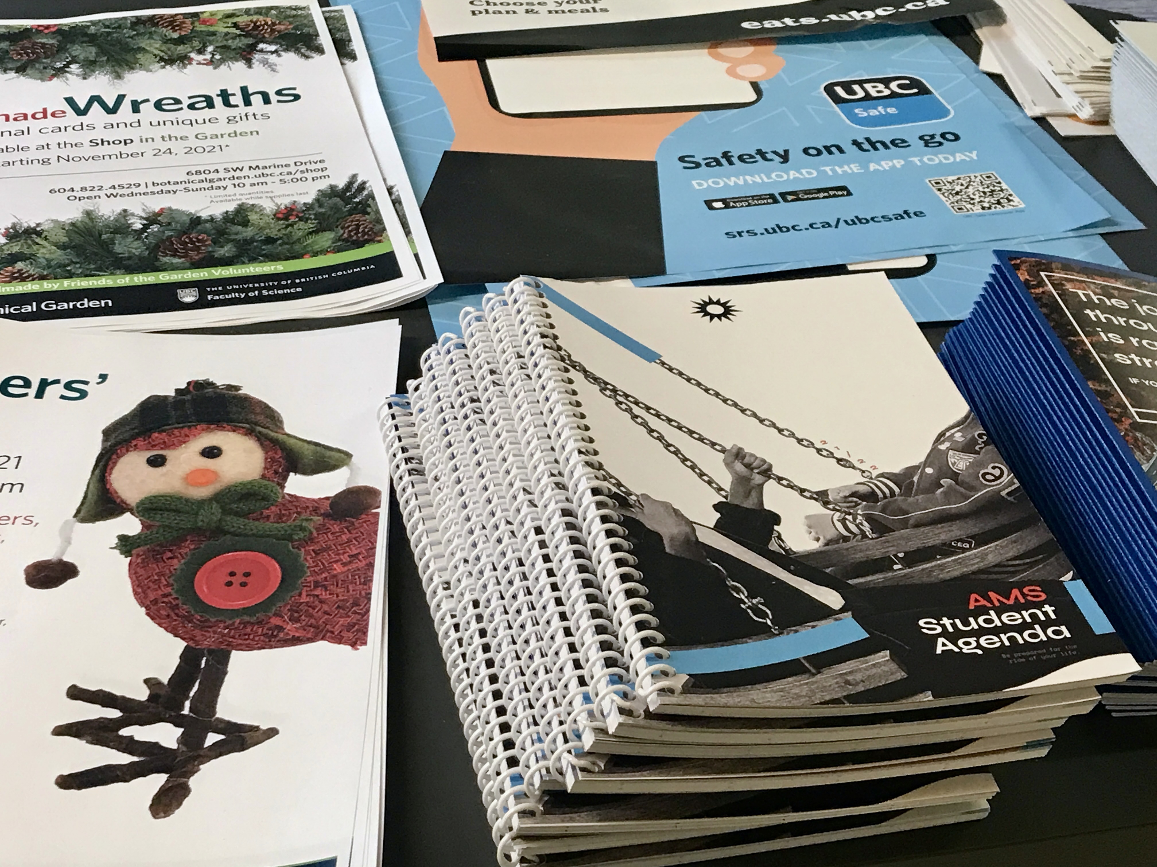
2 months; 3,000 copies were printed and handed out to students in August 2021
Support
Adobe Indesign, Illustrator, Photoshop
Timing
2 months; 3,000 copies were printed and handed out to students in August 2021
Support
- Brand identity refresh by Partners & Hawes
- Copywriting proofreading by AMS Marketing Manager, Eric Lowe & AMS Managing Director, Keith Heister
- Design feedback from AMS Lead Graphic Designer, Priscilla Chu
︎ Notes on Design
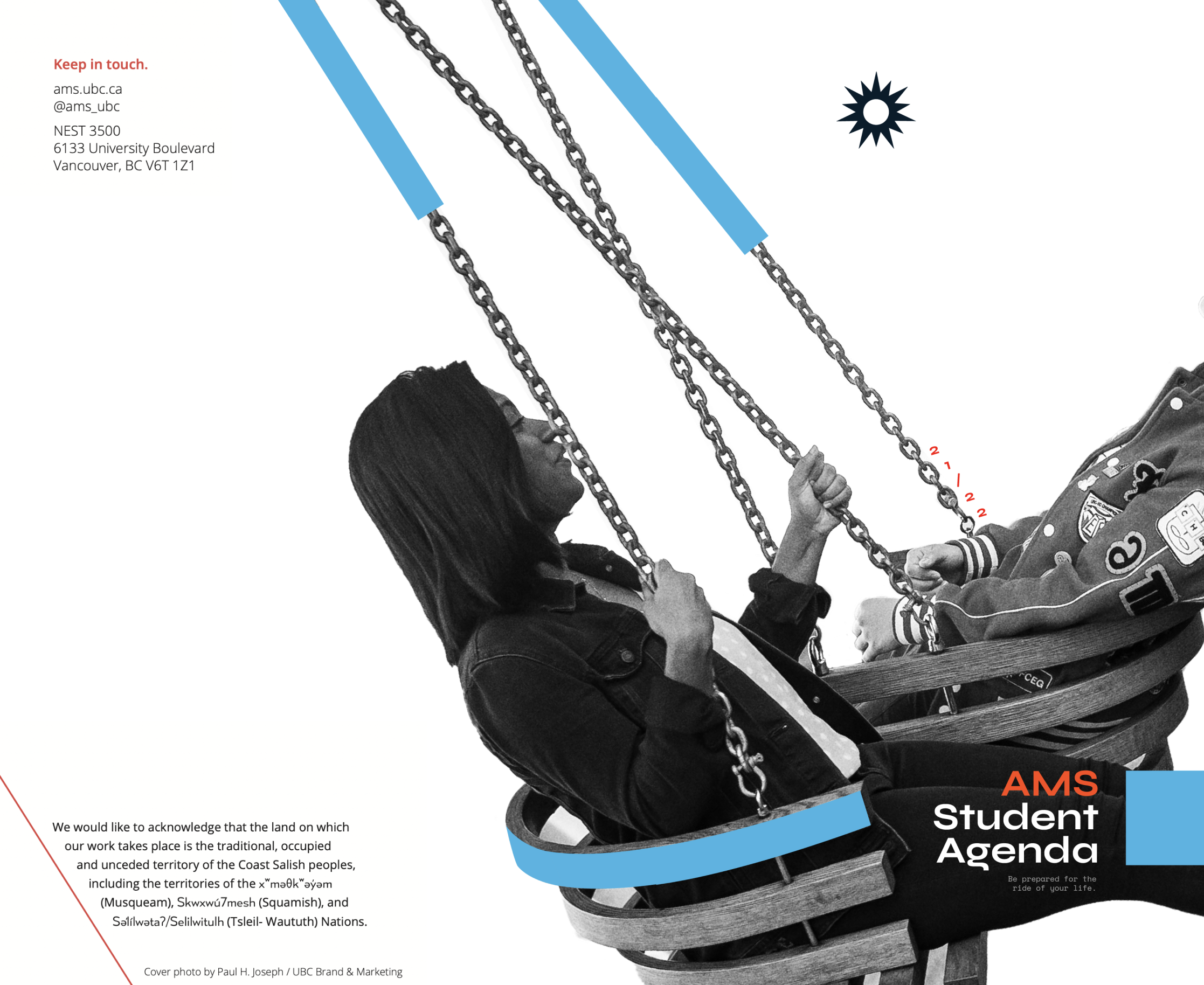
- The cover features 2 students sitting on a 2-way swing. The design conveys the inevitable ups and downs of a post-secondary education—yet, through it all, one will find those who will swing by their side, cheering them on along the way, including the AMS.
- On every page, I embodied the new brand motto "students first." I asked: What do students really need? What would students really find useful? I then proceeded to add various design elements that supported this mission. For example:
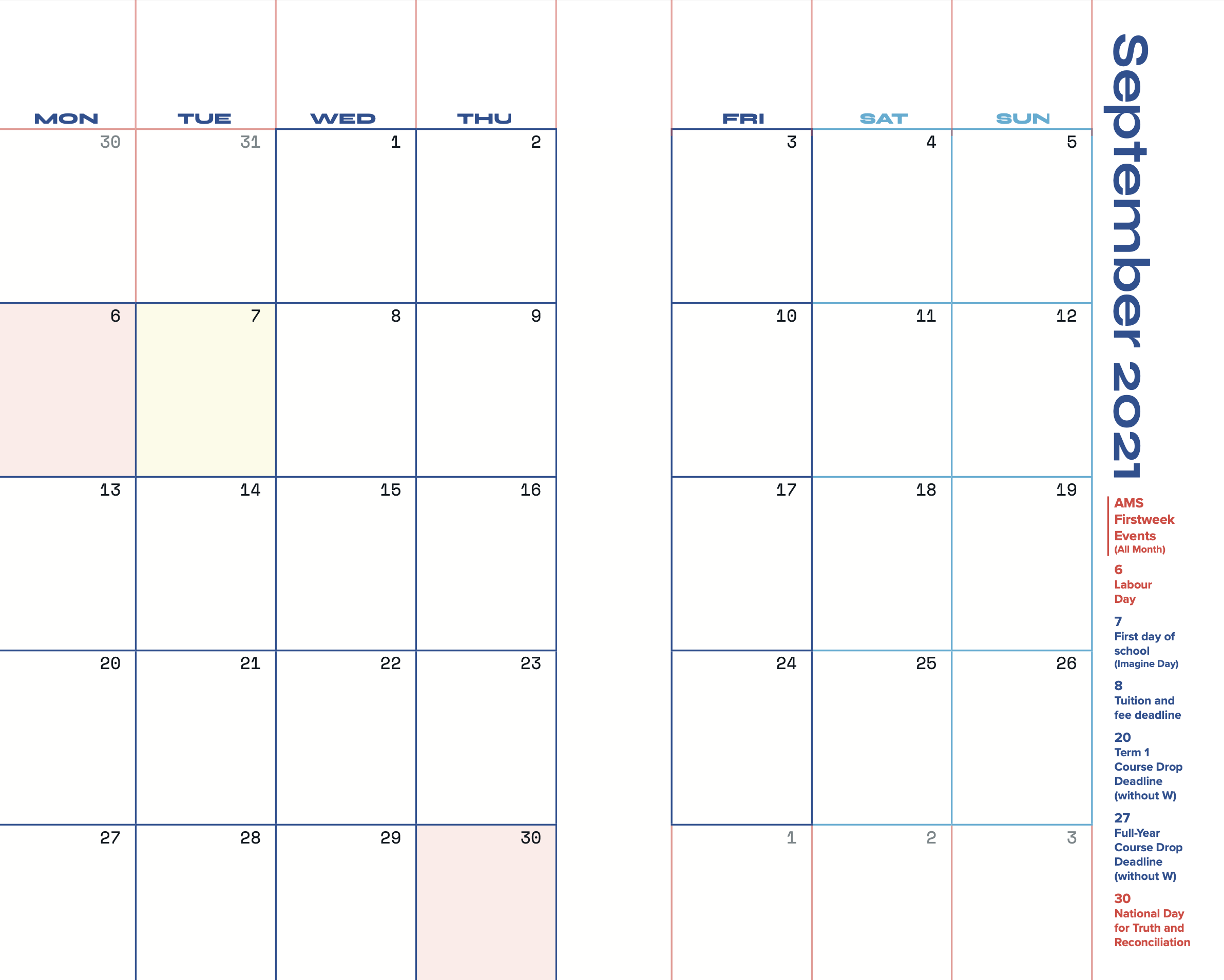
︎ On the monthly spread, important dates are listed on the right, and highlighted in the calendar. On the weekly spread, fun facts and uplifting blog posts are linked at the bottom using QR codes.
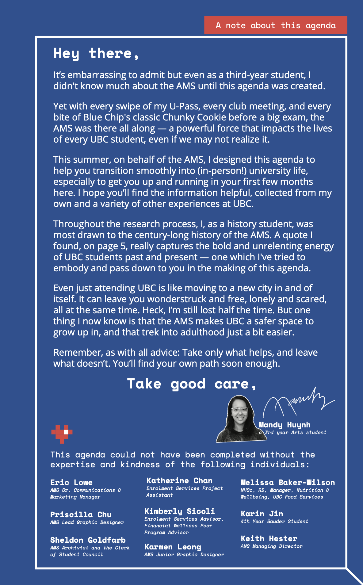
︎ On the last page of the diary, I wrote a letter to first-year students to add a personal touch.
︎ I innovated an approachable organizational chart to explain how the AMS works (which was a mystery for most students).




End of Project 02
Exhibition Design, Large-Scale Print, Spatial
︎Frankenstein Exhibition
Conceptual Design, Print, Spatial
︎Universal Music Concert Poster
Print, Brand Identity, Copywriting
︎ Student Diary & Survival Guide
Conceptual Design, Print, Digital, Brand Identity
︎ Happy Holidays Card
UI/UX Design, Brand Identity